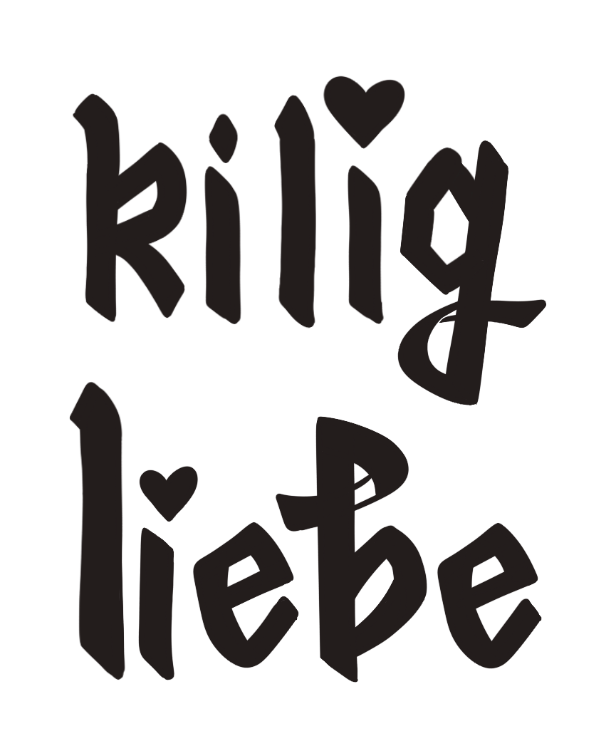
Cover Story: Kilig and Liebe
Another reminder to myself—if you want to yap, blog about it. And I wanted to yap, because I’m a little proud of this one, so we’re going to blog about it!
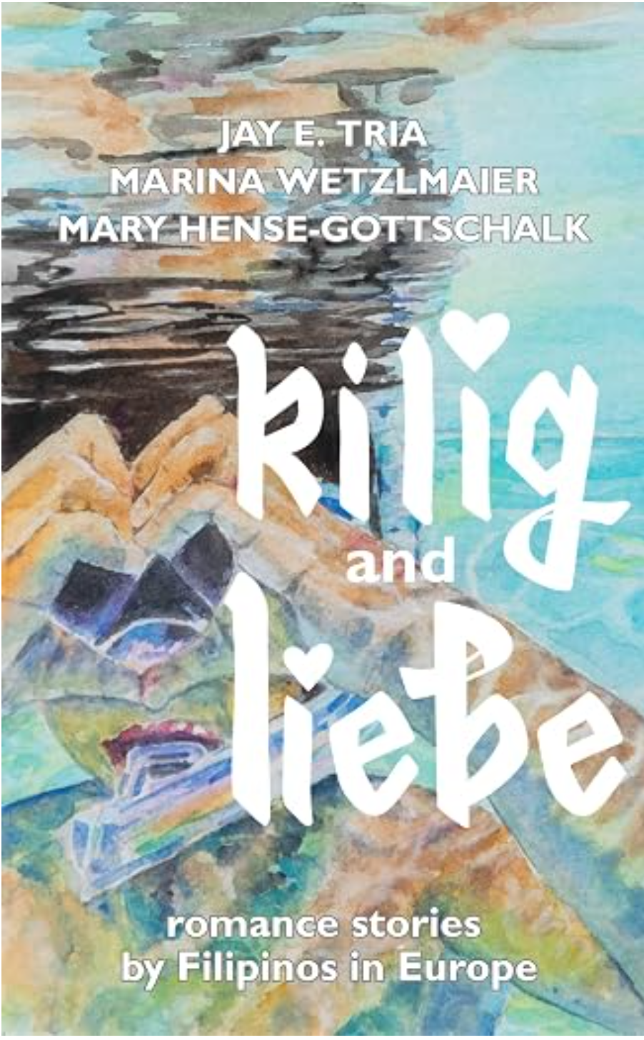
Kilig and Liebe: Romance stories by Filipinos in Europe
Two teens from the same school and table tennis club run into each other at the bus stop. Just another YA meet-cute, but this time it's German guy Max and Filipino-German girl Claire, and the big bag of groceries from the Asian food store that she has to bring home.
A veteran winter sports athlete returning after an injury has to deal with tense competition and the attention of an attractive teammate. Just another sports romance, but this time it's about Filipino-Austrian freeskier Tina and the younger social-media star athlete Andy.
In an office building in Sweden, a woman runs into her ex-boyfriend, and starts to wonder if they can pick up right where they left off. Just another second chance romance, but this time it's Filipino-Swedish Lianne knowing that it was her Filipino family dynamics that led to the breakup with Alexander, and that's something she can't easily change.
Romance stories we know, from perspectives we may not have noticed before. A reminder that we can share love and kilig all over the world.
Get the book here
When I was asked to do the lettering and the cover design for the Romanceclass Halo Halo Project—now called Kilig and Liebe—I wondered which direction to go in that was bold, easy to read but wasn’t exactly the same sans serif font you’ve seen over and over. I initially started by looking at the Bauhaus movement, a school famous for its midcentury design simplicity and a philiosophy of using what you already knew in a radical way. The design was bold (literally) and straight to the point. This reminded me a lot of the week I spent in Frankfurt, where I finally understood what ‘frank,’ meant.
I started at the Letterform Archive, a great resource for type history. They had a whole article on the typefaces used in the Bauhaus movement, and I fell in love with their experiments with the Fette Gotich font. Extremely formal but very European to me. I remember feeling overwhelmed walking down a street and seeing buildings that predated the colonization of the Philippines on one side, and then a kitschy little boba shop on the other. Because that was Europe in a nutshell to me? Steeped in history, and their relationship with the present has a feeling of retro contemporary (to me).
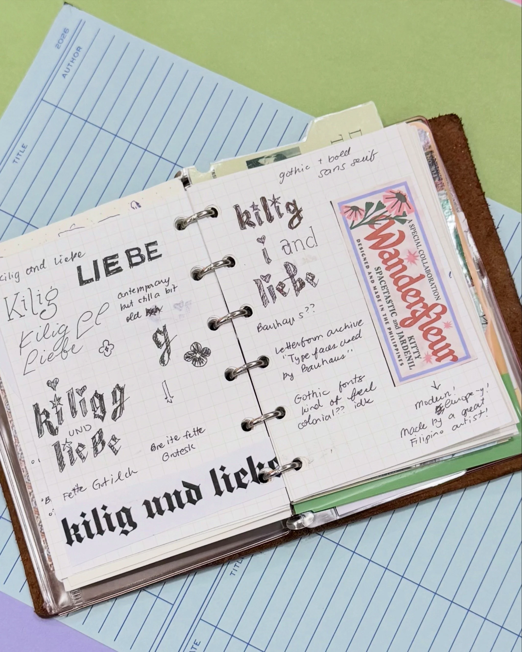
On the Pinoy side, I wanted letters that were medyo OA, and that was it. A word as strong as ‘kilig’ needed something romantic but fun, and that definitely wasn’t going to be found in a sans serif font.
Some experiments and Google research later, I found an article on Rolling Stone about the preservation of “the cultural legacy” of Filipino typefaces. It’s a pretty great read and does that thing where it makes me recognize a sad fact that I didn’t want to before—our government’s signage doesn’t really have a singular visual identity, which sort of adds to the general confusion of the mess that is navigation here, and—ANYWAY. I was in a spiral until I read something Jo Malinis said, which cleared the fog in my brain.
“It’s a Filipino typeface if a Filipino made it. It’s as easy as that.”
So that’s where I started. I remembered last year I really really really wanted to get the Spacetastic x Kitty Jardenil, and I thought it perfectly embodied what I wanted. Something classic but still felt modern, and this one had stars! Love.
With my thoughts kind of settled, I set to work on the iPad, drawing the forms over and over, refining and defining until we got the current title!
The final step was to upload things to Canva and arrange the letters with the rest of the front matter that needed to be added. It seems simple now that you look at the finished product, but the rabbit holes this project took me on was fun!